


Elliot Andre Photography
Logo Redesign Case Study


Project Overview
Elliot Andre (EA) Photography came to us with a familiar problem where they had outgrown their current logo. EA Photography started as a street/urban photography company selling more prints of their artwork, but as their business grew, bookings and photoshoots have now become their primary source of revenue.
While their current logo was clean, it was illegible at smaller sizes and didn’t appeal to their new target audience.
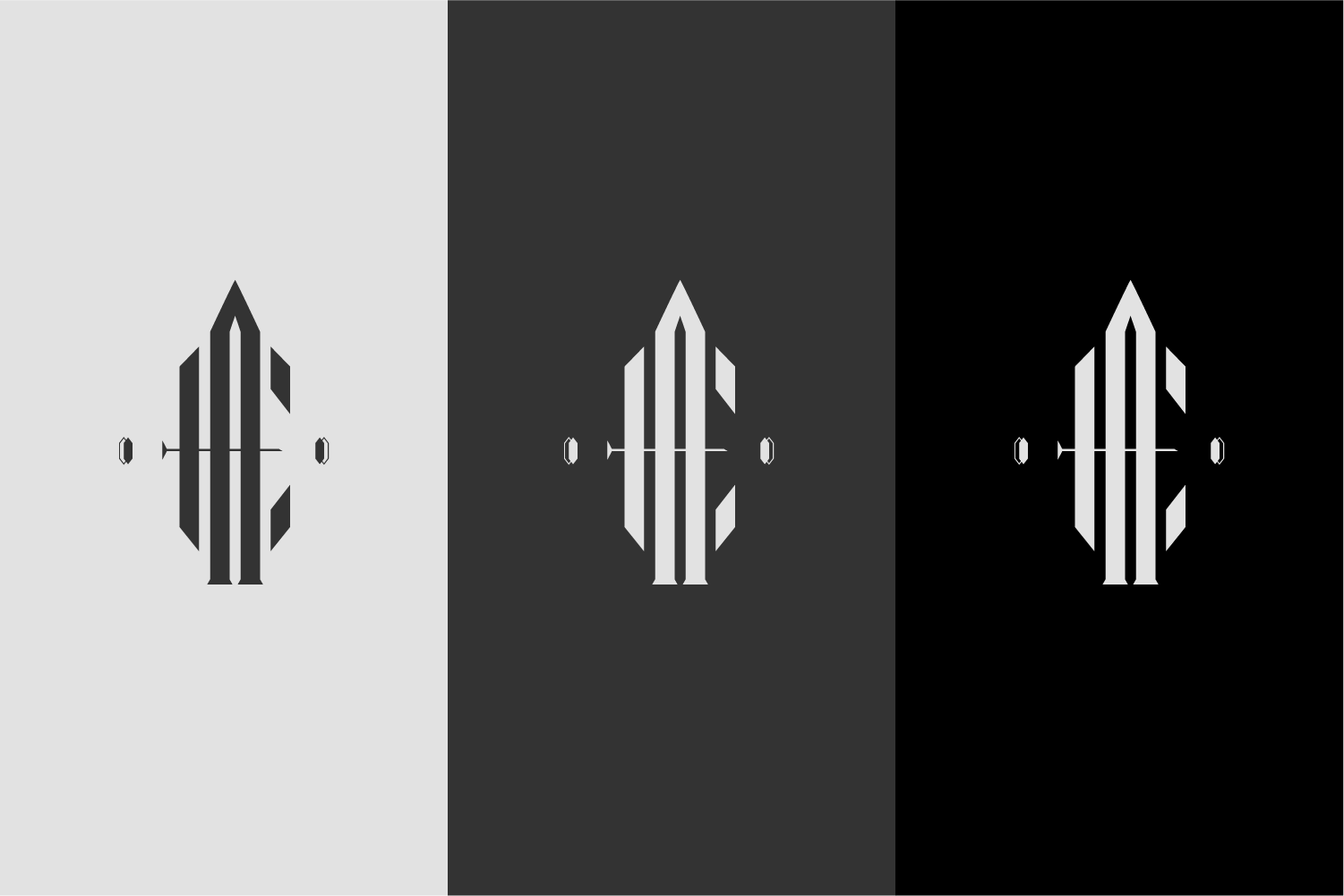
Logo Strategy
During the discovery process, EA Photography listed “Modern, Upscale, and Young“ as adjectives they wanted to be associated with their brand and new logo.
They wanted a traditional monochromatic color palette consisting of black, white, and grey. Another key factor to note was that they wanted no traditional photography elements in their logo; this meant no cameras, shutters, etc. This left us with designing a wordmark-style logo or monogram.
Logo Solution
After an exhaustive series of rough drafts, EA Photography ended up loving this monogram logo. This new logo perfectly encapsulated the modern and upscale they were going for while still maintaining enough uniqueness to be long-lasting and grow with the business for many years to come.